Let’s have a quick chat about shelf styling. Filling up a bookshelf, floating shelf, or even a table with shelves can be tricky. There’s a balance between making it look complete and putting too much on it. We’ve got a few different shelving areas in our home that I’ve styled, so I thought it would be helpful to share a few basic tips and “styling principles” that I utilize.
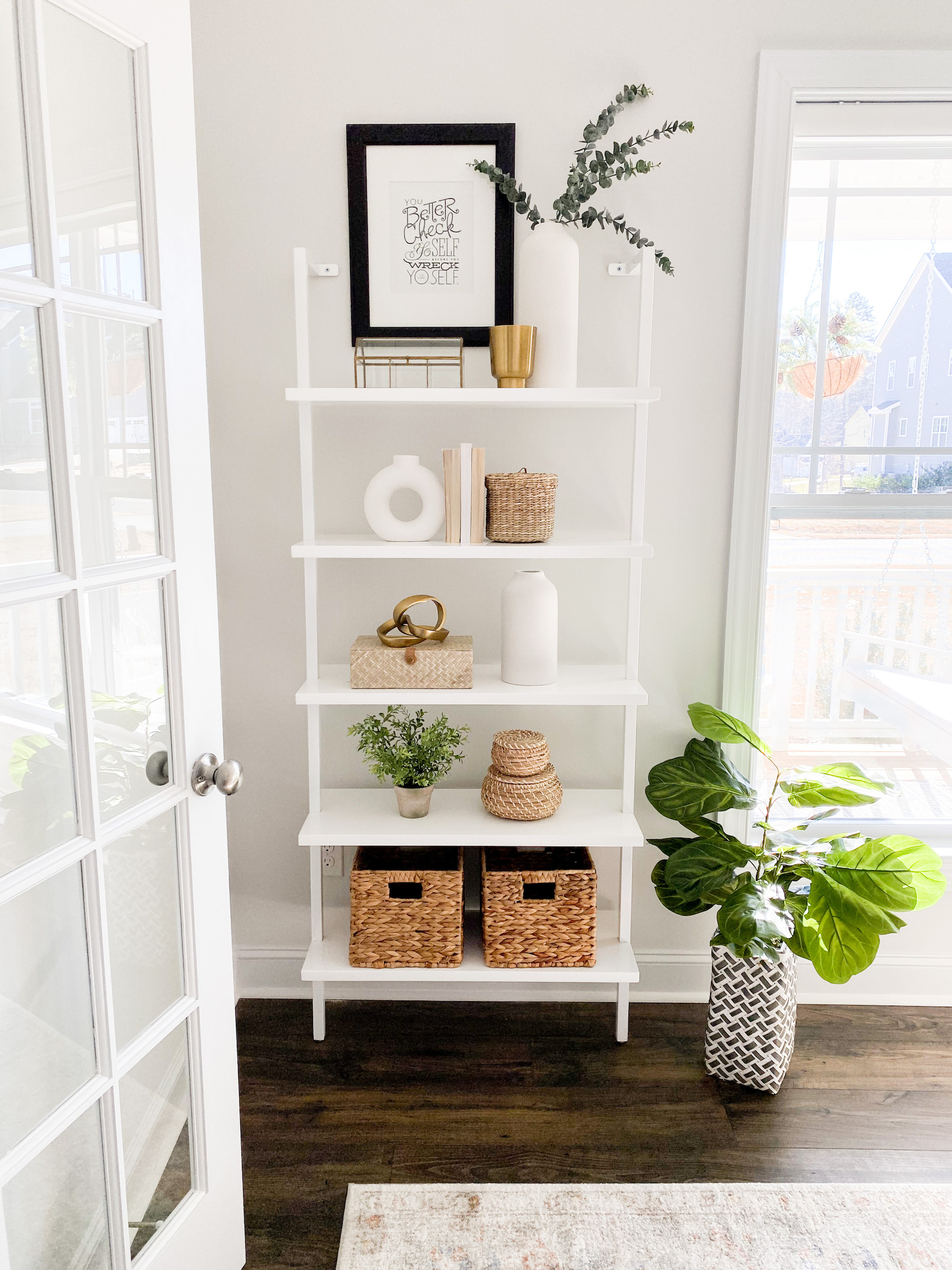
Shop the Photo: Shelf // Tallest White Vase // White Vase // Round White Vase // Gold Figurine // Woven Box // Seagrass Baskets with Lids
Pick a color story, overall aesthetic, and the look you’re going for
In my opinion, the most important part of styling shelves (or really any space) is done before you even start buying or styling. Before you do anything, figure out what your end goal is. If that means browsing Pinterest, Instagram, and magazines to find something you like to recreate, do that. If you have a vision in your mind and just need to flesh it out a bit, do that! It doesn’t matter how you set yourself up for the styling part, just that you have a plan going into it. This will make it far easier to source and shop for accessories, as well as creating a cohesive end result.
In action: for this bookshelf in our front sitting room, I knew I wanted a very light, airy, simple result. The three white vases were my inspiration for the rest of the shelves. I loved how simple the vases were, so I knew I wanted them to be featured on the shelves. Since I didn’t want it to be all white, I added in the woven/basket detailing to contrast the white vases and shelves.
Utilize the “Rule of Threes”
Have you heard of this before? The concept is that decorative accessories look best in groups of threes. While this isn’t a hard and fast rule, it’s a good guideline to go by, especially if you struggle with balance. It doesn’t have to be three – sometimes just two objects work, like the two baskets. Other times, putting five things in a grouping will feel balanced, like the second shelf. It does seem that odd numbers work better than even, though. You can see that shelves one, three, and four all have just three elements on them.
Create subtle patterns
One thing that I really like to do with decorating something like this is to create subtle patterns. It’s rare that I go for symmetry, but I do like for there to be a flow for the eye to follow. For example, the white vases counter each other on the top three shelves by being offset (right-aligned, left-aligned, right-aligned). In contrast, the woven items offset one another on shelves two, three, and four. Doing this encourages the eye to go up and down the shelves. If you look at both the vases and the woven items, your eye will bounce from shelf to shelf. I like doing this for balance, so that one object of shelf doesn’t override the rest of the space. I find it easiest to do this with color or shape.

